
My team and I shared 2 passions: Hiking and gaming. We decided that we wanted to create an app that could combined those two hobbies. Another thing we had in common was that we had friends who have never been hiking before and we wanted to create something that would help them enjoy their first hikes, and thus the idea of Take a Hike! was born.

We interviewed 5 avid hikers asking why they enjoy that hobby, tools they use, and any common pain points they experience. Here is what we learned:
After synthesizing our interview data, we realized that our research group was wrong. Instead of focusing on avid hikers, we should have interviewed those who are interested in navigation games as that demographic would have given us a better insight on what we could do to make hiking more accessible for them. Due to time constraints, we could not do a second round of interviews. Instead, we decided to focus on the pain points avid hikers have on hikes and try to come up with ways to resolve them with out app since if avid hikers are having that issue, then new hikers may have them as well.
While we were synthesizing our data, we also did a competitor analysis to see what our potential competition is doing better and how we could improve upon their ideas. Here’s what we came up with:
+Simple and engaging gameplay loop
-Drains phone battery fast
+Has detailed trail information and navigation instructions
-No in-app tutorial
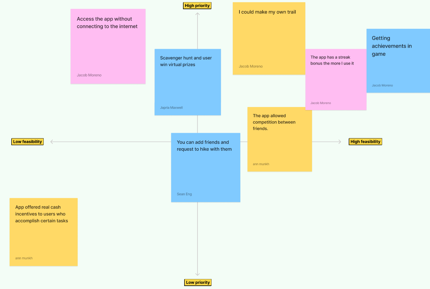
Finally, we created a prioritization matrix to cover any other ideas we thought would be interesting and beneficial to include.
+Easily create and share scavenger hunts
-unintuitive error messages
+Contains useful information of local trails
-Poor filter feature makes it difficult to find specific locations
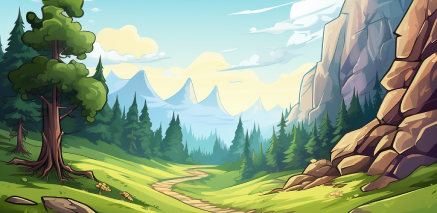
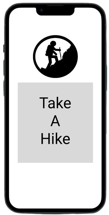
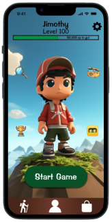
No one on my team, including myself, were artist. Rather than attempting to make the art ourselves or attempt to hunt down stock images that sort of matched what we had in mind, we decided to turn to a new technology at the time: image generating AI. Using the software, we generated many of the backgrounds and icons for the app, giving us the exact cartoon and playful aesthetic we were aiming for.
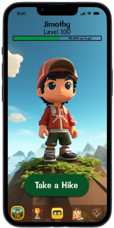
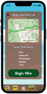
Right off the bat we knew we wanted to avoid the minimalist style that many apps use. This is because, while we enjoy that style, we felt that this app gave us a a chance to try a styles, fonts, and colors we have yet to experiment with. This is what lead us to pick the fonts we currently use, which were inspired by Disney games we used to play. Color-wise, we wanted something that represented nature, which lead us to pick brown, green, yellow, and blue.
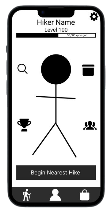
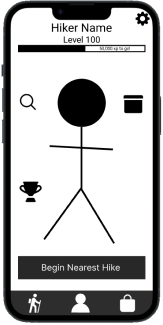
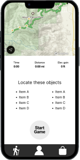
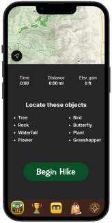
While usability tests of our lofi prototypes showed no major issues, there were a few notable design choices we decided to fix when moving from low fidelity to high fidelity. On the homepage, we decided to move a lot of the buttons to either the navbar or deeper into menus within the sub areas. This made the homepage less cluttered.
Originally we were going to have all our menus be in dark mode as all of us were dark mode enjoyers, but when taking a step back and evaluating our product, we decided that we did not like it because it did not match cartoony theme we wanted. To fix that, I did an overhaul of the entire aesthetic of the menus to better match the energy we wanted.

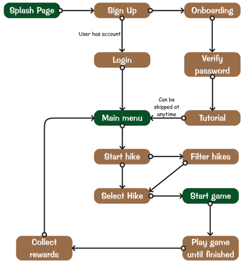
This was definitely a unique project experience for me. This was the first time I got to design UI that wasn't in the minimalist aesthetic. It was definitely more challenging than I expected, but I'd like to do more stuff like this in the future. Time constraints also a massive limiting factor on how far we got in this project. There were a lot of ideas we wanted to add from our prioritization matrix, but because we only had just under 3 weeks to complete the project, we could not fit in all our ideas. Instead, we decided to focus on the main flow of the game, which was finding and playing the game.
Using AI in my flows was also an interesting experience. With this project, We used AI to synthesize our research data, help pick a color palette, and generate icons and backgrounds. I’d like to see where else I can fit this emerging tool into my UX process, but I would like to try not to heavily rely on it. I’m well aware of tools, such as Galileo AI, that can create prototypes for me, but I would prefer to stay away from them as the designs they produce start to look identical once you’ve seen enough of them since, as of now, AI has no creative mind and can only produce what its been fed. As of now, I will be using it to act as an extra member of my team and have it complete the more menial tasks or use it to cover my own weaknesses, specifically graphical design.
If you like what you see and want to work together, get in touch!
jacobmoreno2022@gmail.com