
As part of a design challenge, my team and I were tasked to redesign the homepage and press room of the NSA. After analyzing the issues their website had through various research methods, we identified the core issues the site faced and redesigned the homepage and news page to be more consistent, visually appealing, and easier to navigate.

Through a heuristic analysis, we found 4 primary issues with the website.
Many testers struggled to navigate the website without the assistance of windows shortcuts. This tells us that the current page layout is not easy enough to navigate and users need to use other methods to find what they are looking for, which less tech-savvy users may not know about.
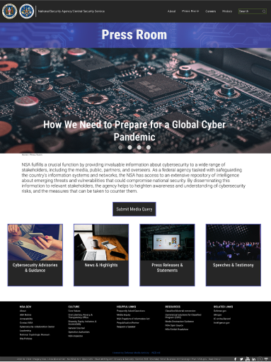
In the press room section, we decided to add a button at the bottom to allow people to access the press room from this area, as previously the only way to get to the press room landing page was through the navbar.

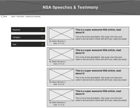
In addition, we also redesigned each subarea to be consistent with each other. Previously, each area had a different way of displaying their information. Our first iteration of each area had each area homogenized so they all looked and functioned identically, especially with the filters, as each different area had a different filter design that did the same thing.
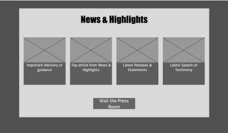
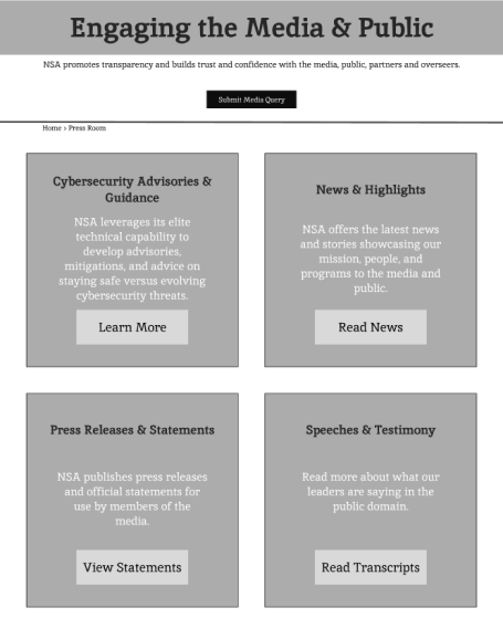
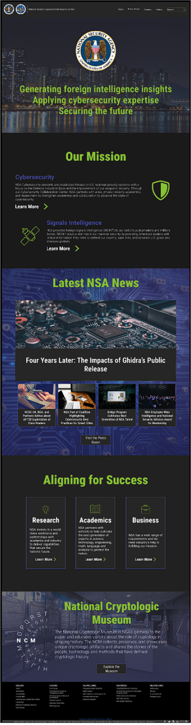
The press room landing page saw more significant changes. The original homepage had a different layout for each subarea and looked very empty. To better layout the homepage, we created a card with a small description of each section.
Our initial prototypes did not change the homepage a whole lot. Our initial idea was to section the homepage into cards to better match the dark mode theme we planned for in the future.
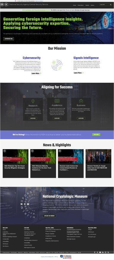
While we enjoyed their current stylization, their colors did not meet WCAG AAA standards. Using Adobe Color Wheel, we made tweaks to the colors so that they would meet those standards. We also decided to change the site's homepage to dark mode because we thought it would look more sleek and complimented the colors better.
With the completion of the first iteration of our prototype, we ran a set of user tests. Many users expressed that they enjoyed our version of the site over the original. This was proven true because they had no major issues navigating our version of the site. We also did an AB test asking users which variant of the homepage they preferred. A majority of the testers stated that they preferred the static design over the complex one, which we decided to go with.


Overall, I’m quite satisfied with the outcome. I was able to cover just about all the changes I wanted to make to this site. Although I do wish I could have used some of the components I created in the final iterations, I understand what some users meant by it being overwhelming. To me, this showed me that there was a difference between what I thought was cool versus what the users need. This is something I will take into consideration on future projects.
If you like what you see and want to work together, get in touch!
jacobmoreno2022@gmail.com