
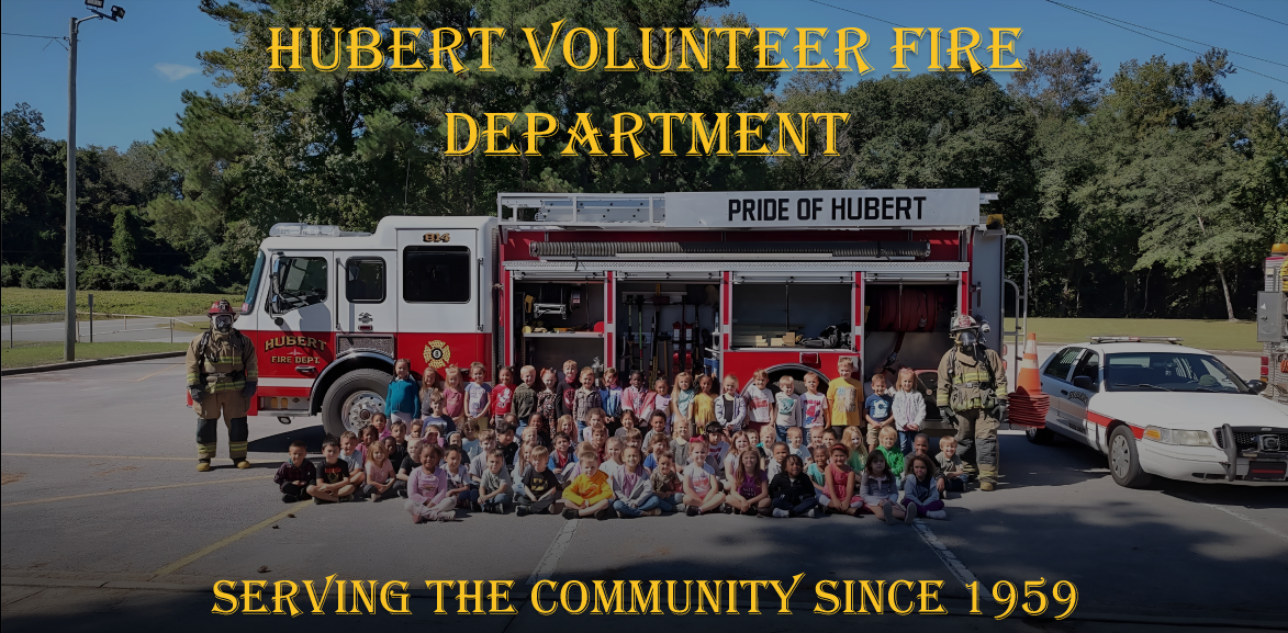
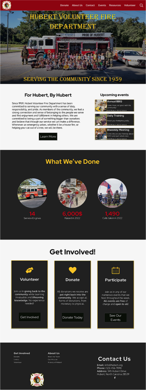
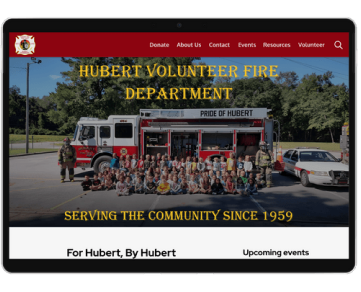
Hubert Volunteer Fire Department (HVFD), is a small volunteer fire department located in Hubert, North Carolina. Their mission is to make their small town a better place in any way possible. One thing HVFD has always struggled with is growing and retaining new members. They believe that it's because of the lack of their online presence. To help them with their mission, my team and I planned to created a website that would allow those who are interested in HVFD to learn about their upcoming events, donate, and volunteer.
We looked into the capabilities of other local fire departments and community centers near HVFD. We learned that, while those organizations paid their employees and were typically more well-funded, the fire departments required more certifications and time commitment and the community centers had old websites that contained outdated information.
We looked into the capabilities of other local fire departments and community centers near HVFD. We learned that, while those organizations paid their employees and were typically more well-funded, the fire departments required more certifications and time commitment and the community centers had old websites that contained outdated information.
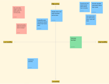
Based on our user research, we compiled a set of ideas of what we want to add to HVFD's website, then used the prioritization matrix to determine which ideas to focus on.
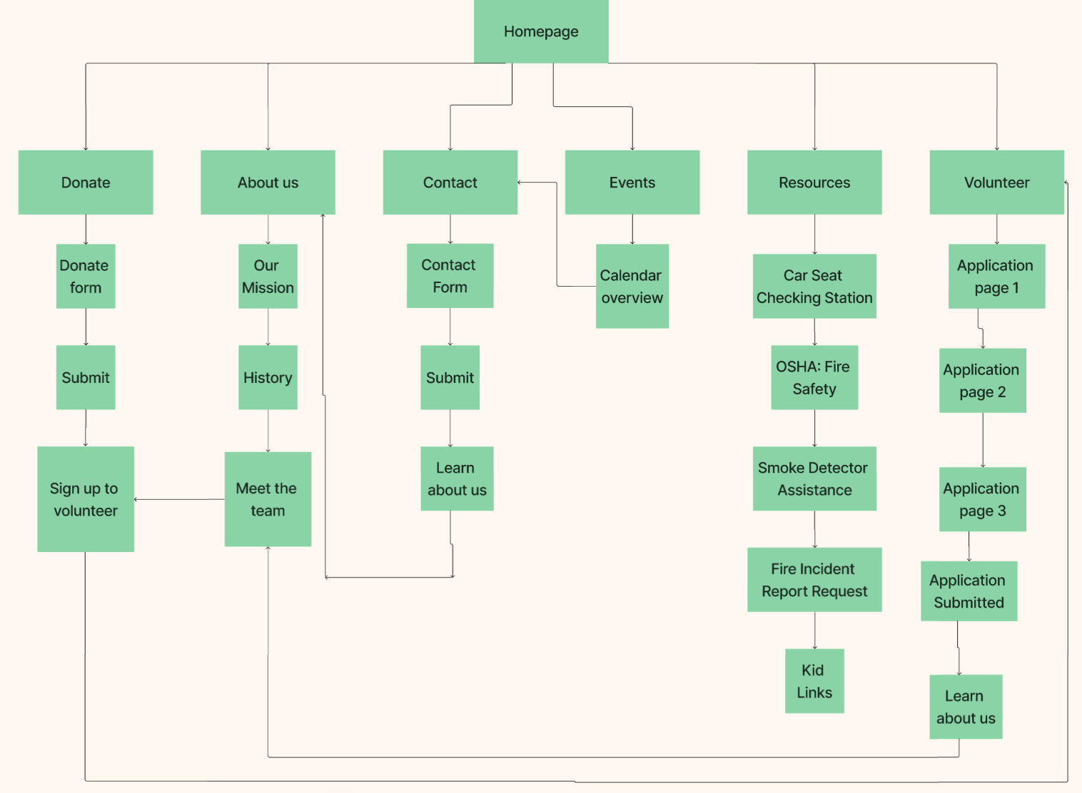
Our user research also gave us insight on how to lay out the website. The three main flows we wanted to prioritize were donating, volunteer, and finding event information. To also control the user flow, at the end of certain pages, we placed a way for the user to visit another page there based on what the page they're on and the page they are most likely to visit next.
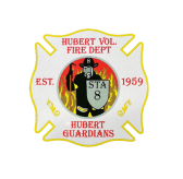
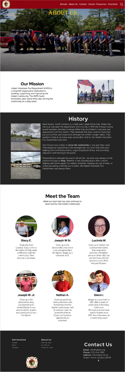
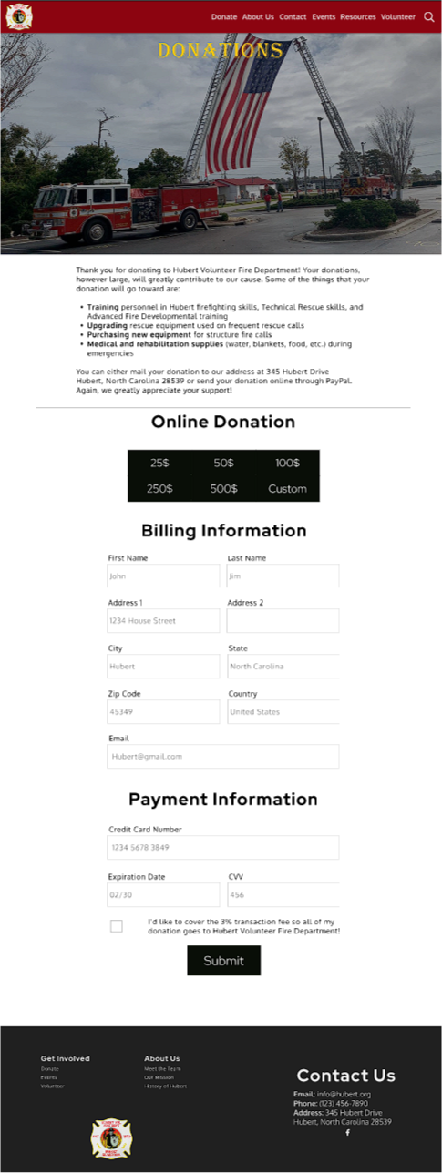
One major issue this project faced was obtaining usable media from HVFD. Not only were they difficult to get a hold of, many of the images and videos the organization provided were nigh unusable due to them being either low quality or not digital. Some of the images we were able to salvage by using AI to upscale them. Their logo, however, was a big challenge. The only image of the logo we received was a picture of a badge. In order to make it usable for the website, I learned how to use GIMP in order to create a digital version of the logo.
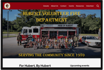
We also had to develop a style guide for HVFD. For colors, we decided, to match the colors on the badge as it was a good color scheme for a fire department. For fonts, we wanted to give the website a more professional tone so we refrained from using anything super playful. The fonts we chose were Algerian regular, oxygen regular, and red hat display bold.

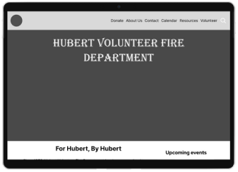
Once the style guide was completed, we began work on the prototype. My primary focus on this project was the homepage, the calendar page, and other various UI elements. For the navbar, I wanted to make it so that a user could access any page on the website from there. The first iteration featured a dropdown menu when hovering over certain sections, but then I realized that some pages could be condensed into a single page. After redoing the user flow I was able to make every page on the website accessible from the navbar.
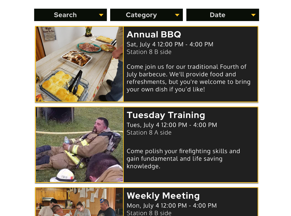
For the calendar, I decided to try a card view. This way, the user can quickly see how many events are coming up along with a small blurb about them.
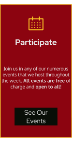
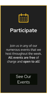
After each major prototype iteration, we performed a set of user tests. While there were no major issues regarding the usability of the site, there were some comments on the aesthetic. A couple testers expressed how the site was very bright. This was due to our over-usage of the color red. To fix this, we replaced many of the red UI elements of the website with dark grey versions, saving red as a call-to-action color. This made the site less of an eye-strain and more sleek-looking.
We also had to develop a style guide for HVFD. For colors, we decided, to match the colors on the badge as it was a good color scheme for a fire department. For fonts, we wanted to give the website a more professional tone so we refrained from using anything super playful. The fonts we chose were Algerian regular, oxygen regular, and red hat display bold.
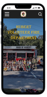
We also created a mobile variant of the website. It functions identically to the main website with the key difference being that the navbar was converted into a hamburger menu that the user can access at anytime.
Since this was for a design challenge, the project is in a completed state. We presented our current prototype to the client and they were extremely happy with it. The next step would be to recreate the site in Webflow and publish it so that they can use it for their own needs. In addition, I would also like to give them other ways to interact with their users online such as a newsletter and a Google Calendar. Unfortunately, once the entire course was finished, my team fully disbanded and went out separate ways. Because of that, I have not been able to contact HVFD for future work due to the person on our team who kept in contact with our client divorced her husband, who was a well-known member of HVFD, and moved across the country. If I were able to get in contact with HVFD, I'd like to attempt to continue the project and finish it with them.
If you like what you see and want to work together, get in touch!
jacobmoreno2022@gmail.com